Introduction
Hello! Welcome to Fontasia.
This blog was created for the Typography Module, as part of my degree in Media, Journalism and Publishing. Our brief is to explore a particular type of typography, producing articles on our findings.
In this particular blog, I will look at the typography used for individual Disney and Disney Pixar films. I noted that each film has its own branding, which gives it a distinctive feel. Alongside the imagery and colour palettes, many Disney films have corresponding logos, and they all have their own typography.
Each article will focus on a different film, examining the posters, logos and merchandise, and their corresponding typography. I want to discuss the purpose of each typographic choice, whilst ruminating on their effectiveness in reflecting the films they represent.
I hope you will find the contents interesting!
Thanks for reading,
Anna
A Note on the Design of ‘Fontasia’
The idea for my header design came to me quite quickly. I wanted to find a clear and effective way to showcase the key purpose of my blog: to analyse branding in Disney and Disney Pixar films. Initially, I toyed with the concept of a header written in Walt Disney’s signature handwriting, but I wasn’t sure that this would convey my purpose clearly enough. I needed my audience to instantly understand that the website would be focusing on the typography of Disney films.
Developing the Logo and Header
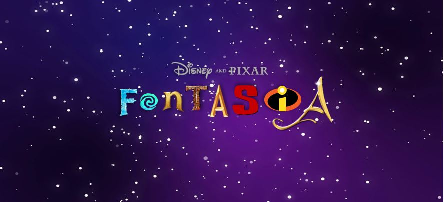
![]()
The biggest problem when designing my logo was working out how to encompass a multitude of brands and designs into one image. I considered companies that have achieved this effect, and instantly thought of the logo design for Mars’ popular chocolate selection box ‘Celebrations’. Mars solved this exact dilemma by creating a logo using typography from every single chocolate brand featuring in their box. That may seem ludicrous, but the design works perfectly. In combining letters from a contrasting range of brands, the logo looks both exciting and full of variety.
What’s quite fun about the design of ‘Celebrations’, is the interactivity of the design. As a child, I often tried to guess which letter on the logo corresponded to which chocolate brand. Now, Disney logos have a similar connection to childhood. Bearing this in mind, I selected letters from recognisable film logos, with distinct typography. I noticed that many of the early Disney films had similar typography - often looping, high-contrast designs with a low x-height (for examples of this, see Snow White, Beauty and the Beast, Cinderella and Lady and the Tramp.) As Disney films transitioned into CGI animation their logos became more distinct, with typography often influenced and aided by computer design.
For my header, I chose a starry background, as stars are often linked to the Disney brand (for example, their intro animation always ends with a shooting star). I also found that a slightly contrasting background looked more professional and dynamic than a plain or gradient backdrop. I also added a slight amount of shadowing to each letter, to give the design more depth. Finally, I noticed that many Disney and Disney Pixar logos include the name ‘Disney Pixar’ just above the logo itself. I added this to my header, to mimic their own branding and to clearly reflect what my blog is about.
In my logo, I have deliberately chosen lettering which is distinct and recognisable, to reflect the strength of these brands. Can you guess any of the films featured?
My Favicon

As you can see, my logo and header design is quite busy. I realised that the logo was unlikely to work when reduced in size, as it is so packed full of imagery. Initially, I wanted my favicon to be created out of text. However, as my logo includes a variety of typography, I didn’t want to introduce further typography to my brand; I felt this would be overwhelming and confusing for the viewer. I thought about choosing a couple of the letters from my logo as the favicon, but was conscious that these letters alone are linked to specific films. For example, if I just chose the ‘F’, it would look like my website focused solely on the film ‘Frozen’. I wanted my logo and favicon to have a really clear connection to Disney as a brand, whilst also being simple enough to be recognised on a website tab.
I decided to draw on the well-known design of Disney’s earliest and arguably most memorable character, Mickey Mouse. My hope behind this was that a silhouette of Mickey Mouse is very easy to recognise, even if it is very small. The favicon was really easy to create, as I just combined three black circles to represent the mouse. It’s a design which is frequently associated with Disney, and was no problem to replicate myself. I’m pleased with the end result, as it clearly ties to the brand and works well when reduced in size. I also used black so as not to detract from my colourful header and logo. I think the two designs compliment each other well, and also reflect the brand of Disney very clearly.