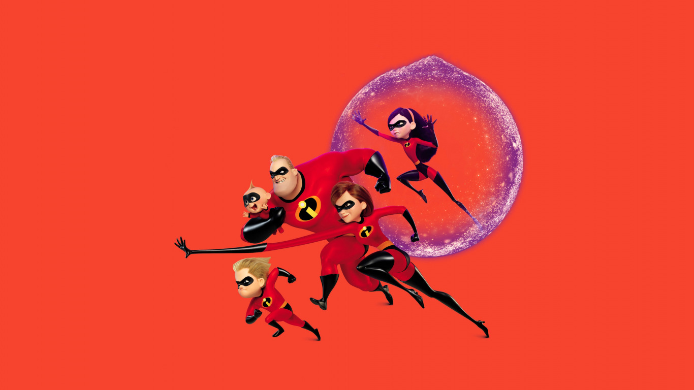
This week I have decided to analyse the typography of the 2004 Disney Pixar film ‘The Incredibles’. Unlike any of the previous fonts, the logo for The Incredibles includes a title design and a typographic icon. While both use the same typography, the icon is coloured differently and uses only lowercase text.
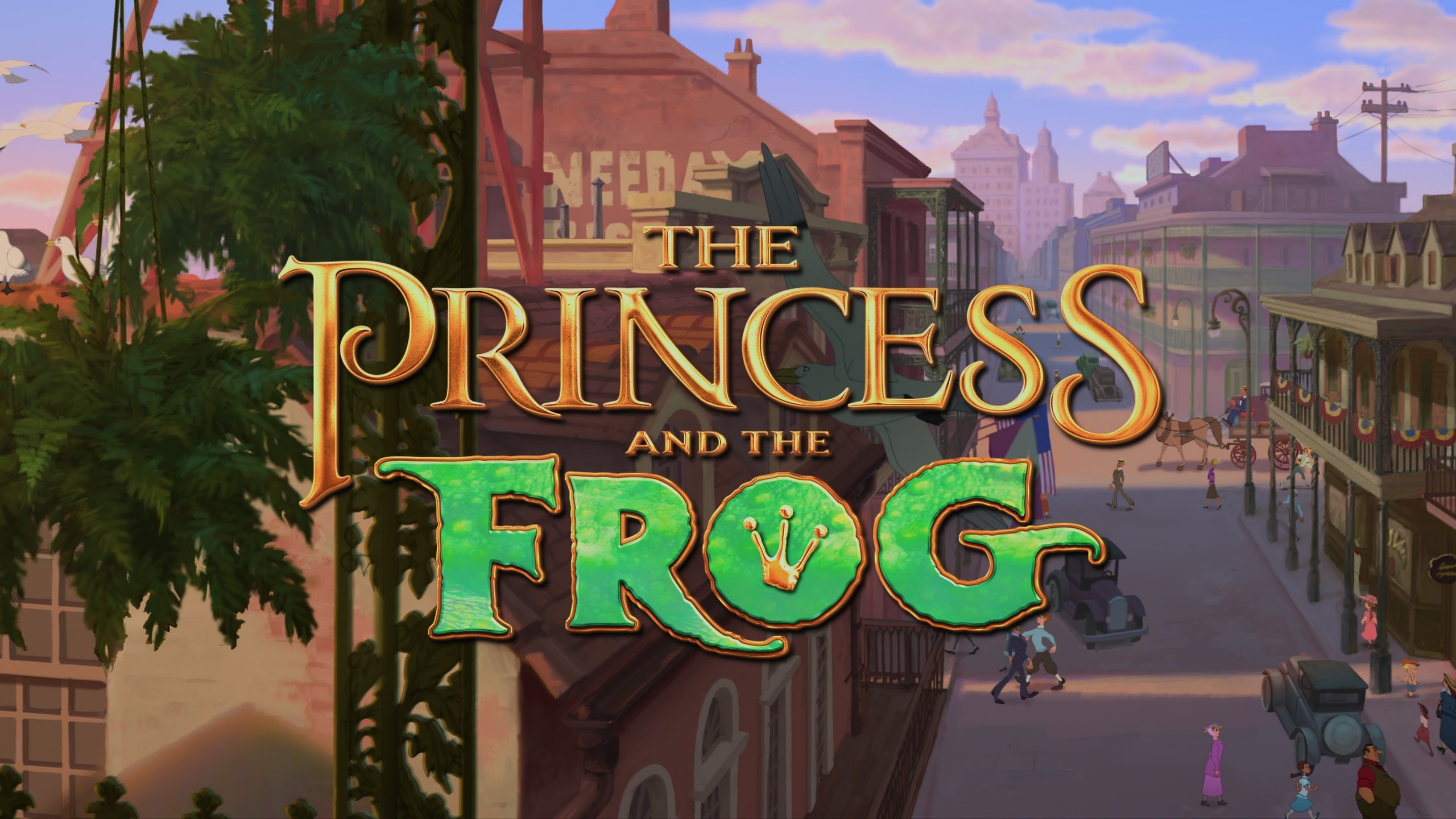
This week we will study the typography of the 2009 picture ‘The Princess and the Frog’, released by Walt Disney Pictures alone. Interestingly, The Princess and the Frog was the studio’s first hand-drawn movie in five years, breaking away from Pixar-influenced CGI, to replicate their traditional animation style. The soft colours, sumptuous drawings and Jazz-age setting give the film a nuanced, crafted and human quality. However, the logo contrasts decidedly with the animation style.
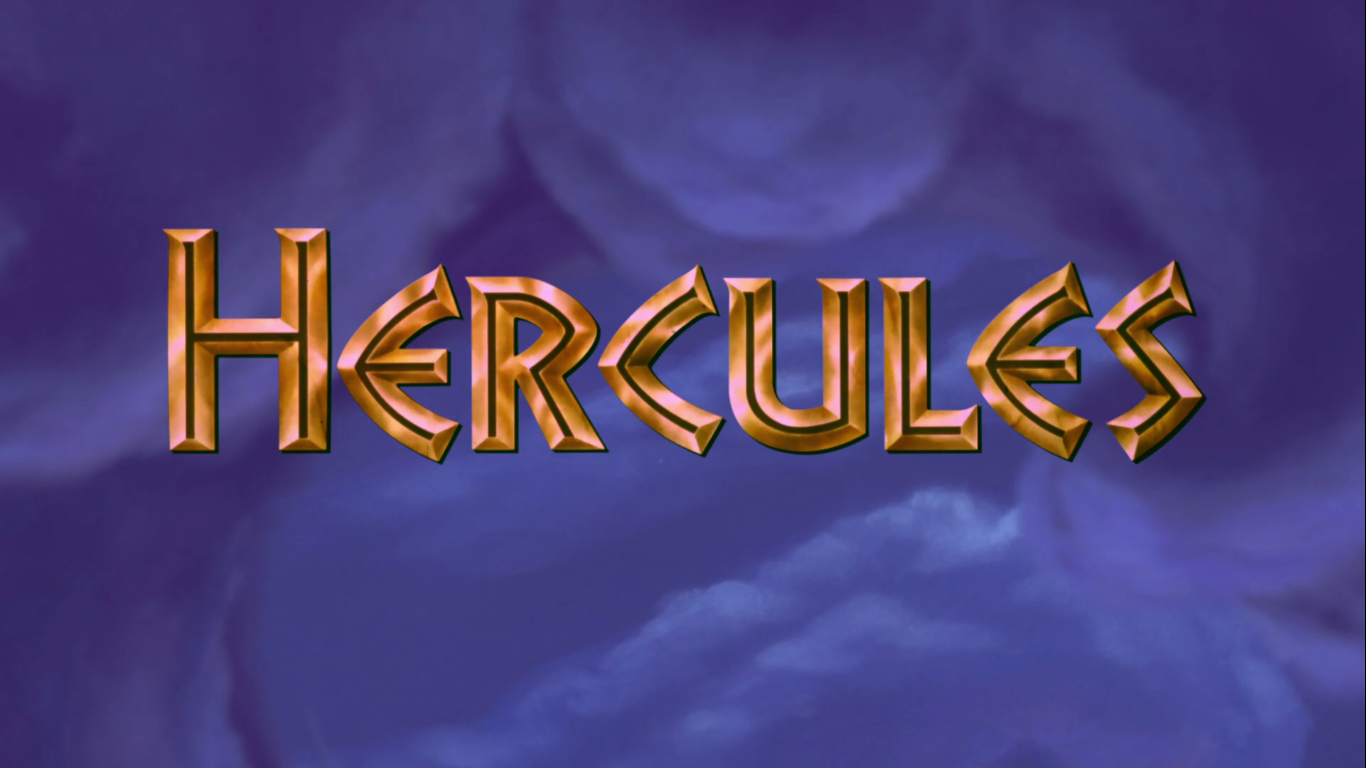
The typographic design for Hercules (1997) reflects both the storyline and the historical references of the film. The story draws heavily on traditional Greek mythology, so it makes sense that the typography would mimic traditional Greek design.
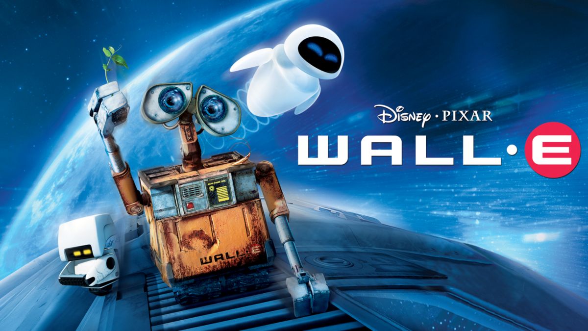
Stylistically speaking, the typographic design for the 2008 film WALL-E is the most simplistic font I have looked at so far. The text is uppercase, and without flourishes or serifs, with a consistent cap-height across the letters. The letters are also low-contrast and geometric, so they do not look as if they were made by a human hand. In terms of typographic voice, I would describe the logo as emphatic and rigid. However, much like the typography for Ratatouille, I think the simplistic design represents WALL-E perfectly.
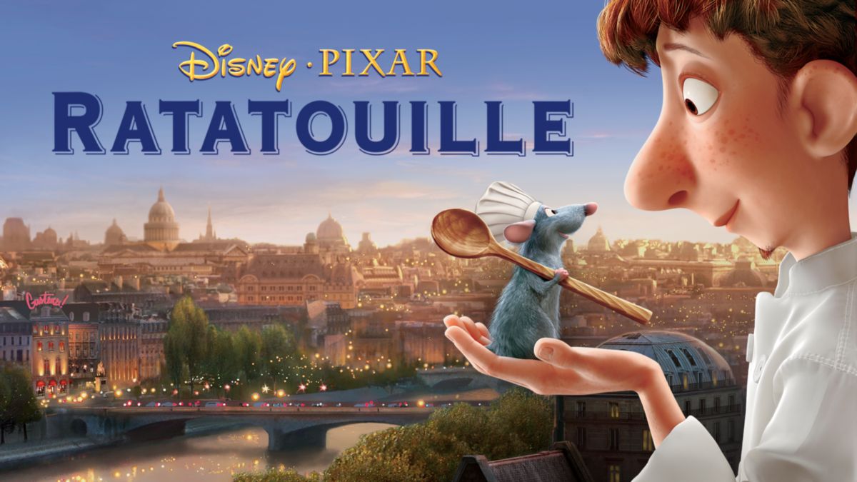
This week I decided to take a look at the typography of the 2007 Disney Pixar film Ratatouille. Unlike some of the previous fonts I have analysed, this week’s typography does not seem especially unusual. It does not appear handmade or crafted, and lacks a certain flair and self-expression. But I would argue that this is exactly the point Disney and Pixar were hoping to make.
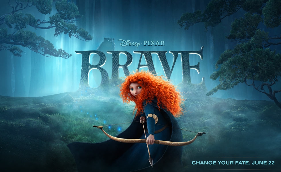
Much like the typographic design for Moana, the typography for Brave draws heavily on historical and cultural influences. As soon as I saw the film poster, I could tell that the story was set in Celtic Scotland, simply from the typography. As someone who is half-Scottish, I am very familiar with Celtic typographic design, which can be found on shortbread tins, whiskey bottles and tartan clothing labels. However, I realised that I know very little about the origins of this typography.
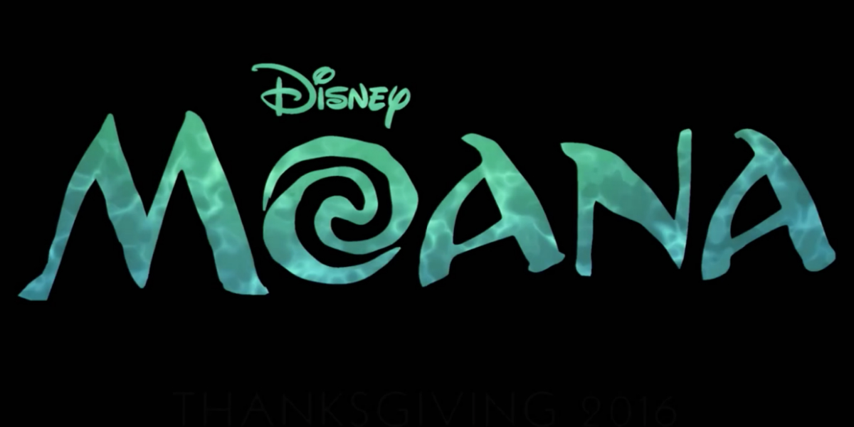
In order to begin analysing the typography of Moana, we first need to observe the cultural influences of the film. The film is set on the fictional island of Motunui, said to reside in the Pacific Ocean. The island itself is described as “Pan-Pacific” by Disney, and certainly draws on the cultural influences of Pacific islands. Personally, I think the visual references of Motunui prominently draw on Hawaiian culture, with Hawaiian-inspired tattoo design, clothing, jewellery and settings. Many of the clothing, houses and utensils used by the villagers appear to be crafted out of wood or bone, as can be seen in the picture below.
When the Disney blockbuster Frozen was announced, the first thing I saw was the logo. As a piece of typography, I think it perfectly reflects and encapsulates the themes and the overall feel of the film. But just what exactly makes it work?