When the Disney blockbuster Frozen was announced, the first thing I saw was the logo. As a piece of typography, I think it perfectly reflects and encapsulates the themes and the overall feel of the film. But just what exactly makes it work?
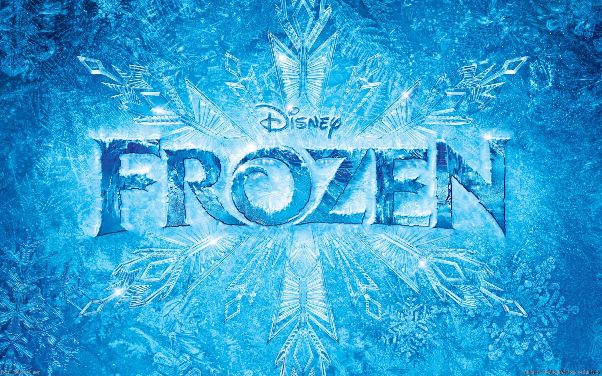
The choice of blocky, uppercase text may seem like a strange decision for the logo of a children’s film; typography of this style is often attributed to masculine tropes, or epic, ammo-packed heist /crime flicks. However, when we analyse the storyline of the film, the typography compliments it exactly. Frozen tells the tale of Arendelle, a city flourishing in an idyllic springtime, which is suddenly swallowed by a seemingly ‘eternal Winter’. The impenetrable sans-serif, uppercase typography reflects the unflinching Winter perfectly. Indeed, on the movie posters, the logo looks as if it is made of gleaming ice. Combined with the revealing title, we instantly know the key themes and settings of the film. The hyper-realistic ice of the movie-poster typography also informs the audience that the film is CGI animated. Unlike many of the hand-drawn Disney fonts of previous years, Frozen is part of a new era of design.
However, there’s also a certain Scandinavian charm depicted in the typography. In the film, the ice is created by Elsa, a young princess. The slight flicks and craft-like embellishments at the edges of the letters suggest craftmanship and personality behind the ice. Although the typography is uppercase, it does not seem threatening, and instead holds a certain stylistic appeal.
I chose to include this particular depiction of the logo because of the interesting border. The city of Arendelle itself draws on Danish design tropes throughout the film, with doors, furniture and clothing intricately patterned with flowers and looping lines. I think these design elements compliment and contrast the stark typography, whilst also cleverly depicting Winter and Spring (both key themes in the story). These Scandinavian style choices also detract from the severity of the uppercase typography, again suggesting a craftsmanship and certain beauty. It is common knowledge that Frozen was loosely based on The Snow Queen, a fairy-tale by Danish author Hans Christian Andersen. Perhaps these Danish-inspired style choices were a homage to the famous author, and his legacy left on Scandinavian culture. Either way, the style choices effortlessly encapsulate and juxtapose the themes of Winter and Spring, which are so key to the storyline of the film.